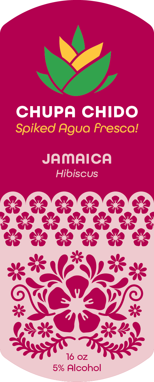


Chupa Chido
The market is scarce for Latine-based alcoholic beverages. Targeting a new audience can freshen up the options on the shelf. Chupa Chido’s Agua Frescas provides 21–40-year-old Mexicans looking for a spiked fruit drink with a natural recipe for a light refreshing experience. The message is intended to feel familiar and authentic to Mexican–American culture. The use of Spanglish targets audiences in a casual tone of voice.
I developed a project brief for Chupa Chido considering the client, product, context, problem/need, goals and objectives, audience, customer value proposition, and personas. I also designed a brand identity including type pairings, a logo and lockup, a color palette, and icons. I researched various containers for the product's packaging, considering the look and feel to coincide with the brand identity.